Dashboards became the default interface for enterprise data. They exist in nearly every BI platform and data workflow. Executives check dashboards for KPIs, analysts build them to share insights, and organizations rely on them for visibility into business performance.
Dashboards solved a real problem when they first appeared. They made data accessible to non-technical users, standardized KPI reporting, and reduced the need for analysts to repeatedly answer simple questions. But over time, dashboards became the only interface for analytics in many organizations.
The issue is not that dashboards are broken. It's that the business problems around them have changed. Modern businesses require systems that explain why metrics move and what actions to take, not just systems that display numbers.
TLDR :
Dashboards standardized KPI visibility and reporting across teams
They fall short when used for investigation and decision-making
Static structures cannot keep up with dynamic business questions
Metric fragmentation reduces trust in analytics outputs
Investigation is shifting to AI-driven conversational workflows
Dashboards remain essential but are no longer the only interface
Where Dashboards Break Down
The limitations appear when enterprises use dashboards for investigation and decision-making.
Across enterprise BI workflows, a consistent pattern shows up: dashboards are where teams notice something changed, but not where they understand why it changed.
The moment a question shifts from “what happened” to “what caused this,” the workflow almost always leaves the dashboard into SQL, ad hoc analysis, or analyst-led investigation.
1. Dashboards Show What Happened, Not Why
Dashboards display metrics but rarely explain the causes behind them.
The typical workflow:
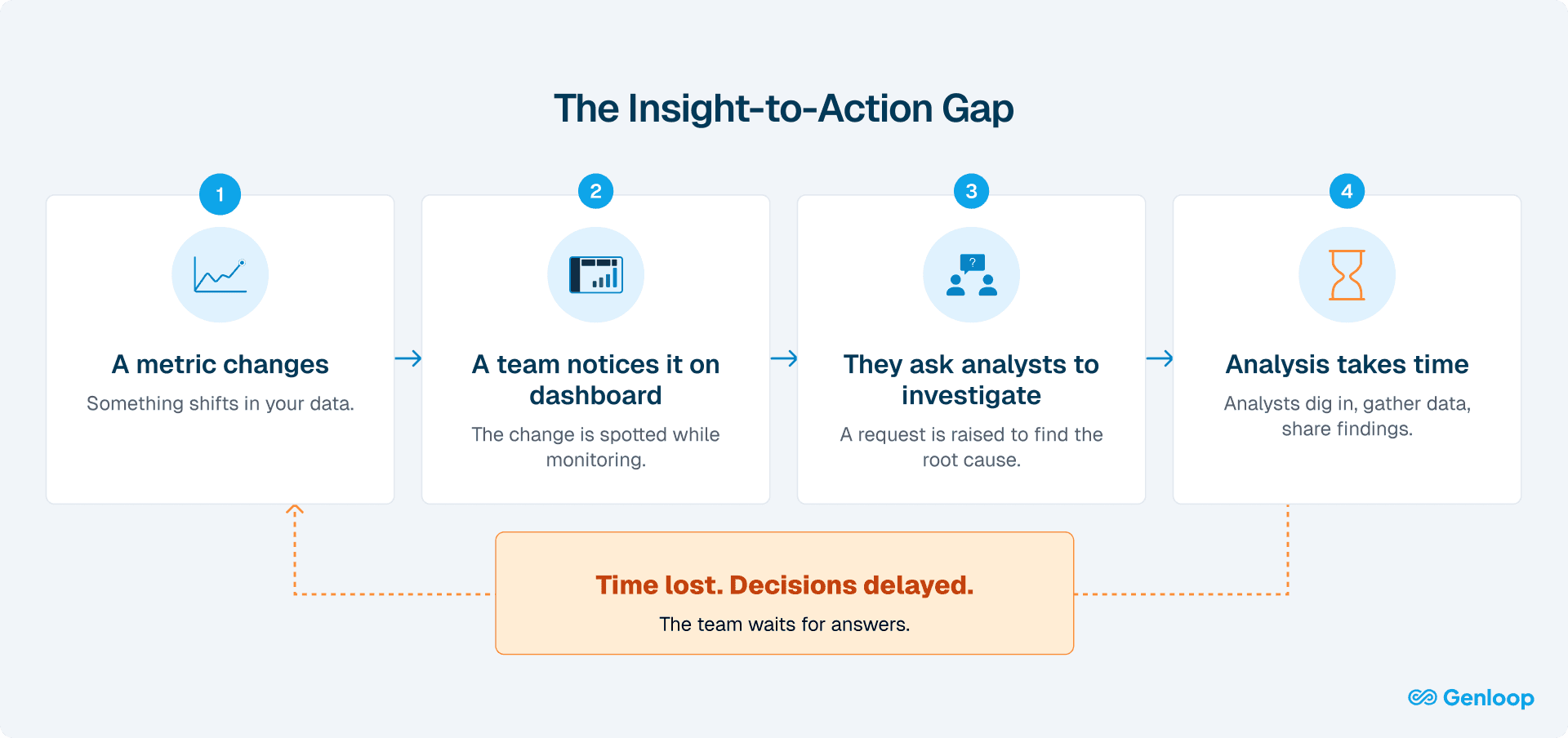
Once an anomaly is identified, users depend on analysts to investigate further. This introduces delays and breaks the flow between observation and understanding.
This creates a decision gap between observing a problem and understanding it. In fast-moving environments, pricing changes, marketing campaigns, product releases, delays of hours or days can be costly.
The core issue: Dashboards were built for visibility, not investigation.
2. Static Design Meets Dynamic Business
Dashboards are built around predefined questions. When a new question arises, the dashboard often cannot answer it.
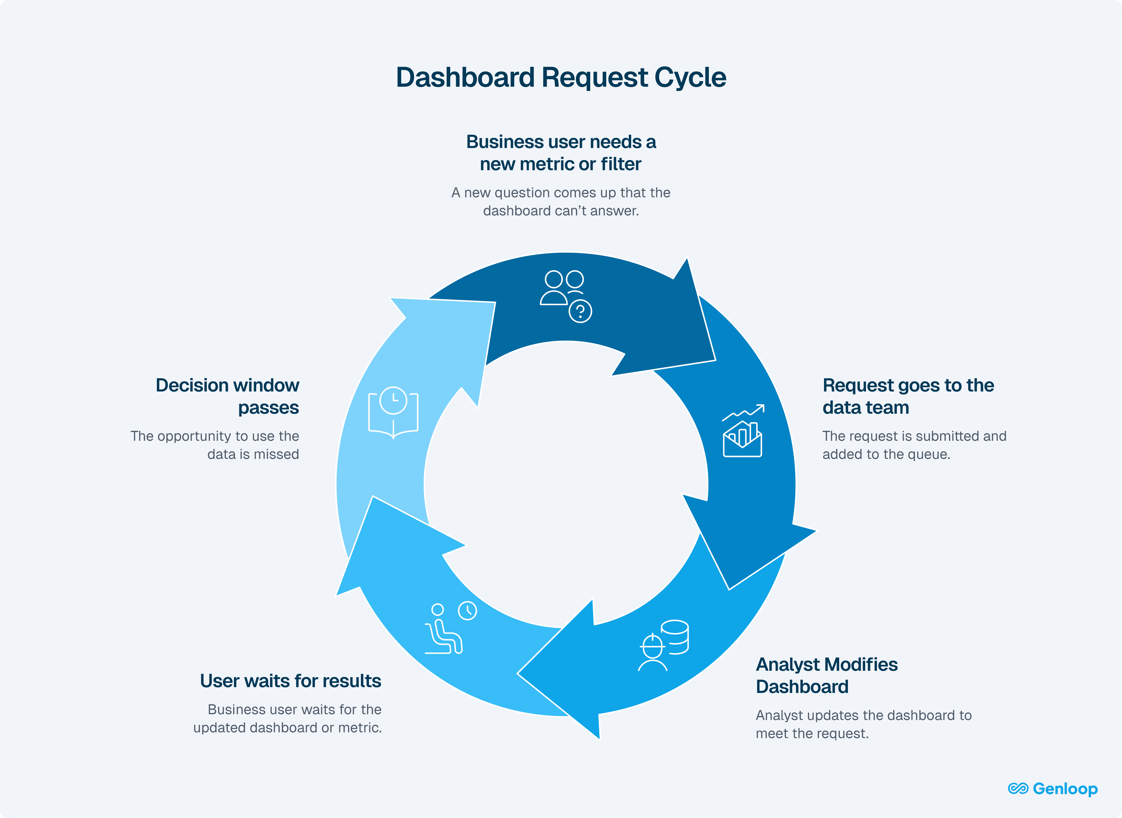
When new questions arise, users often need to request changes, write new queries, or build additional dashboards. This introduces friction and slows down iteration.
By the time the required analysis is ready, the decision window may have already passed, especially in environments where conditions change quickly.
The reality: Dashboards enforce a batch workflow in a world where decisions increasingly require real-time exploration.
3. Metric Fragmentation Across Teams
Different teams often define the same metrics differently.
For example, customer acquisition cost may be calculated one way by marketing, another by finance, and differently again by sales. When these definitions feed into separate dashboards, they produce conflicting numbers for what is supposed to be the same metric.
This creates a breakdown in trust. Instead of aligning on decisions, teams spend time debating which number is correct. Over time, users begin to rely less on dashboards and more on manual analysis or spreadsheets to reconcile differences.
At its core, this is not just a data issue. It is a governance problem. Without a shared semantic layer and consistent metric definitions, dashboards cannot serve as a reliable source of truth.
How Dashboard Usage Is Changing
1. Investigation Is Moving to AI
Dashboards were built to display metrics, not explain them.
When something changed, users had to leave the dashboard to investigate.
This created friction: switching tools, waiting on queries, and relying on analysts for follow-ups. Even simple questions slowed down decisions.
What changes now:
Users can ask questions in plain language and generate analysis in real time:
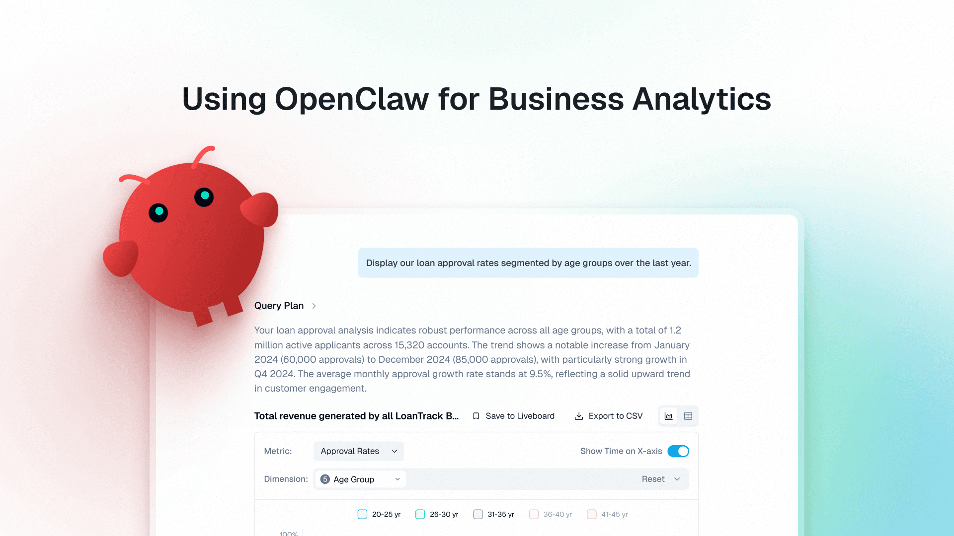
“Why did churn spike in Q3?”
“Why did loan approval rates change across age groups over the last year?”
The system interprets the question and creates a live, context-aware view with the relevant breakdowns using agentic analytics.
The shift: Dashboards remain for monitoring, but investigation becomes on-demand and immediate.
2. Pricing Models Are Breaking
Traditional BI tools charge you to copy your data into their environment, build semantic layers there, then create dashboards on top of copied data.
Problems with this:
Data duplication costs (storage + maintenance)
Governance risks (copies drift out of sync)
Seat-based pricing (discourages adoption)
What needs to happen: Warehouse-native dashboards. No data copies. Semantic layers defined once. Pricing that doesn't penalize broader access.
3. From Broadcasting Dashboards to Collaborative Analysis
Dashboards were one-way: analysts build, users consume.
When teams needed to discuss or investigate something, they had to leave the dashboard and move to Slack or email.
This meant context had to be rebuilt every time.
Screenshots were shared. Metrics were re-explained. Filters and assumptions were lost.
Even when looking at the same data, teams were not working from the same context.
What changes now:
Collaboration moves into the analytics layer through shared, live views.
Liveboards update continuously, preserve context, and allow teams to explore data together in real time without switching tools or recreating analysis
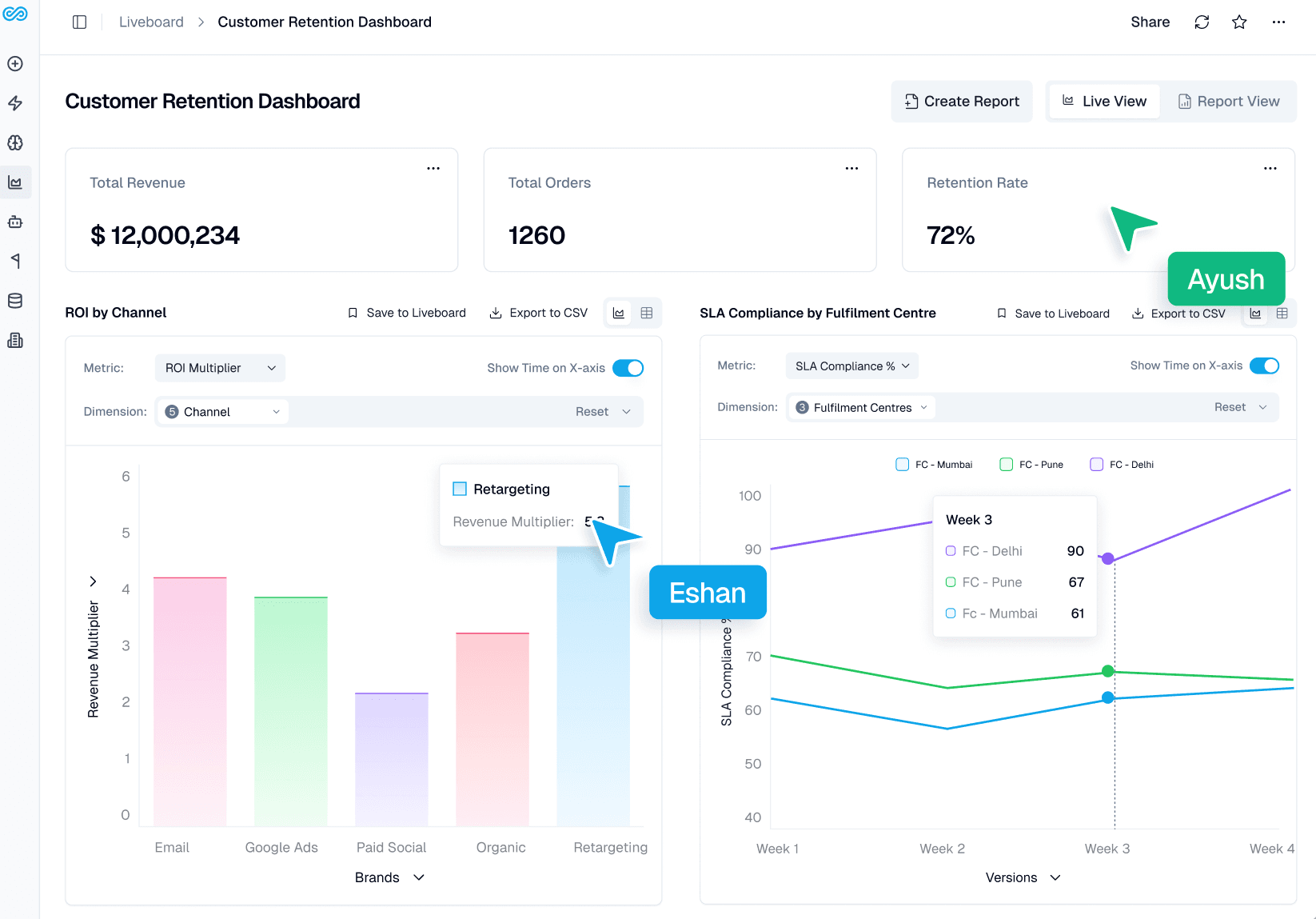
The shift: Dashboards evolve from static reports to live, shared systems where teams align, investigate, and decide together.
4. From Static Dashboards to Interactive Investigation
Dashboards were not built for asking questions.
They were designed to present predefined views, not support dynamic exploration.
This introduced a different kind of limitation:
New questions required predefined queries or dashboard changes
The interface could not adapt to follow-up questions
Users were limited to what was already built
Even simple exploration was constrained by how the dashboard was designed.
What changes now:
Questions can be asked directly from the dashboard:
“Why did this metric drop yesterday?”
“Which segment contributed most?”
“Show breakdown by region and product”
The system interprets the query and returns answers with context.
The shift: Dashboards move from static outputs to interactive entry points for real-time investigation.
Dashboards Aren't Dead. Their Job Just Changed.
Where dashboards remain valuable
Dashboards continue to be effective for standardized KPI monitoring, executive reporting, and creating shared views that align teams around consistent metrics. They work best when metrics are stable, well-defined, and benefit from a clean, structured interface.
What has changed
Dashboards are no longer the only interface for analytics. Investigation increasingly happens through conversational systems instead of dashboard modification workflows. At the same time, pricing and architecture are shifting toward warehouse-native models, and collaboration is becoming embedded within the analytics platform rather than happening across separate tools.
Dashboards remain the shared interface where teams align on metrics, review performance, and communicate decisions. They are not just monitoring tools. They are coordination surfaces for the business.
Conclusion
Dashboards are not disappearing. But they are no longer where decisions actually happen. The real shift is not about replacing dashboards with AI. It is about decoupling visibility from understanding.
For years, analytics operated as a two-step process: see the metric, then investigate it somewhere else. That model is breaking.
What replaces it is not a better dashboard. It is a system where every metric is directly explorable, where questions do not require tickets, and where investigation is embedded into the interface itself.
This creates a new expectation: if a system shows a number, it should also be able to explain it. Dashboards will remain the surface layer of analytics. But the systems that sit behind them are conversational, agentic, and context-aware and will define how organizations actually make decisions.
The companies that adapt early will not just move faster. They will operate with a fundamentally different relationship to data: one where answers are immediate, not requested.
FAQs
1. If AI can answer data questions, do organizations still need dashboards?
Yes. Dashboards remain the primary interface for monitoring KPIs, tracking performance, and aligning teams around shared metrics. What is changing is how users investigate what they see. Instead of relying only on dashboards, teams can now use AI-driven conversational analytics to explore anomalies, ask follow-up questions, and perform deeper investigation without waiting for analysts.
2. What does it mean for a dashboard to be warehouse-native?
A warehouse-native dashboard queries data directly from modern data warehouses like Snowflake, Databricks, BigQuery, or Redshift. Instead of copying data into a separate BI storage layer, the dashboard runs queries where the data already lives. This reduces data duplication, improves governance, and ensures analytics operate on a consistent single source of truth.
3. How do agentic analytics and dashboards work together?
Dashboards are optimized for monitoring known metrics. Agentic analytics is designed for investigation. When a metric changes on a dashboard, users can ask follow-up questions such as “What caused this increase?” or “Which segments contributed the most?” The system then explores underlying datasets and returns explanations with supporting data.
4. Why do teams sometimes see different numbers for the same metric?
Conflicting numbers usually happen when metrics are defined differently across dashboards, SQL queries, or reporting tools. Without a centralized semantic layer, each team may calculate the same metric using different logic. Defining metrics once and enforcing them across analytics systems ensures consistent and trusted reporting.
5. Is modern AI-driven analytics only useful for large enterprises?
No. The shift from dashboard-only BI to conversational analytics benefits teams of all sizes. Smaller teams often experience analyst bottlenecks sooner because they have limited data resources. Self-service investigation tools allow business users to explore data independently, reducing reliance on analysts while maintaining governance.