A Power BI alternative is any analytics platform a team adopts in place of Microsoft Power BI, and in 2026 the reason for switching is changing. Dashboard-first software, built to display prepared metrics and little more, is becoming obsolete, because a static dashboard answers the question its author anticipated and stops at the follow-up. Enterprises of every size, small, mid, and large, now need to ask questions on top of their dashboards, run agentic workflows, and investigate deeply across systems, and Power BI's dashboard-plus-copilot model was not built for that: its Copilot summarises one modelled dataset rather than investigating across sources. This guide ranks ten alternatives on the criteria that now decide a switch: accuracy, AI-native querying, depth of investigation, data-source reach, and cost.
Key Takeaways
Dashboard-first BI is becoming obsolete in 2026: static dashboards report what happened but cannot answer the questions that come next.
Enterprises of every size, small, mid, and large, now need to question dashboards, run agentic workflows, and investigate deeply across sources, which Power BI does not support.
Genloop leads on accuracy, AI-nativeness, platform independence, and cost, ranking first on the public Spider 2.0-Snow benchmark, with a free tier and no per-seat fee.
Dashboards do not vanish; the durable setup pairs a display layer with an agentic layer that answers open-ended questions.
Why Is Dashboard-First BI Becoming Obsolete in 2026?
Dashboard-first BI is software designed to display prepared metrics on charts, with questioning added afterwards rather than built in. Power BI is the archetype, and inside Microsoft its low price made it the default. The paradigm is running out of room in 2026: a dashboard answers the question its author anticipated, then goes quiet when a user asks why the number moved. That follow-up is where value now sits, and a dashboard-first tool cannot do it on its own. Power BI's Copilot summarises one modelled dataset; it does not plan a multi-step investigation across systems or reason toward a cause. Small teams feel this when a single analyst becomes the bottleneck, mid-size teams when questions outrun the dashboards, and large enterprises when the best questions span several systems at once. The demand is identical at every size: investigation on top of dashboards, not dashboards alone.
How We Evaluated These Power BI Alternatives
Each platform is rated across five capabilities that decide better data-driven insights. Query intelligence is how well a tool understands a plain-language question, plans a multi-step investigation, and returns an accurate answer rather than a summary. Data ecosystem integration is how far a tool reasons across warehouses, databases, and applications without copying them first. Business user accessibility is whether a non-analyst can reach an answer without SQL or a modelling change. Governance and compliance covers role-, row-, and column-level control with audit evidence, and operational efficiency weighs the total cost and effort to run the platform as usage grows.
The 10 Best Power BI Alternatives in 2026
1. Genloop: AI-Native, Accurate Cross-Source Investigation
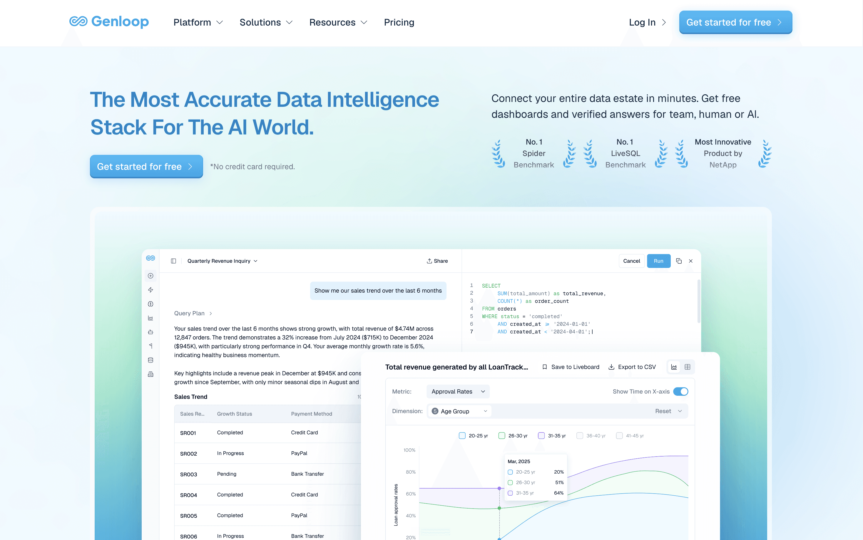
Overview: Genloop is an agentic analytics layer that answers questions in plain language across Snowflake, BigQuery, Redshift, and Postgres in place, with no copies.
Key features: Agentic multi-step investigation; Liveboards for visualisation; a self-learning Living Context Graph; RBAC, RLS, and CLS governance.
Pros: Ranks first on the public Spider 2.0-Snow benchmark; reasons across sources; no per-seat fee.
Cons: Needs upfront context modelling before it pays off; enterprise-focused, so overkill for a single quick chart.
Pricing: Free tier, no per-seat fee; enterprise pricing on request.
Best for: Enterprises that need agentic investigation and accurate answers across several sources.
2. Tableau: Visualisation Craft
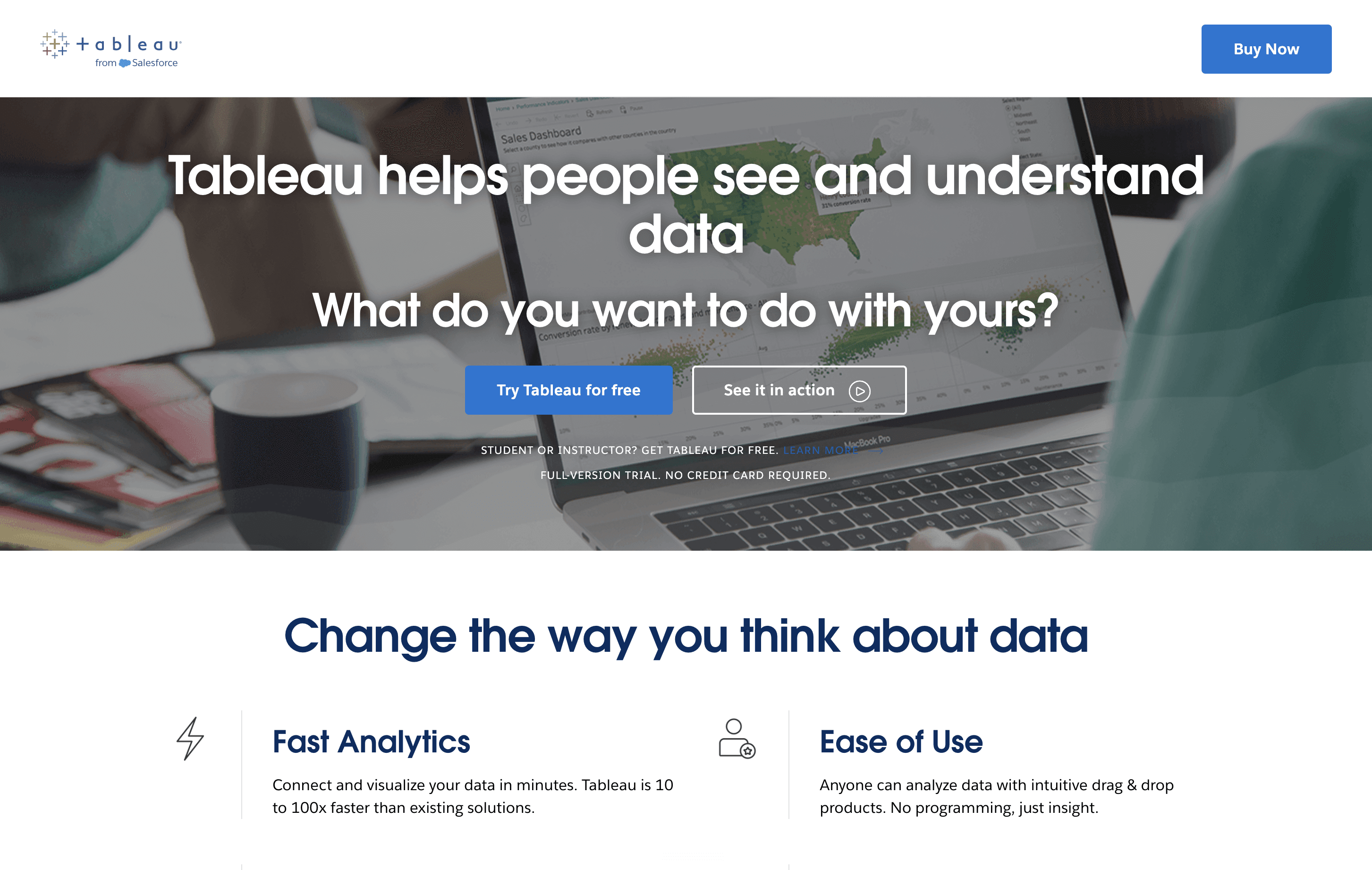
Overview: Tableau is a visual analytics platform known for polished, interactive dashboards built by drag-and-drop.
Key features: Deep visualisation library; Tableau Pulse metric summaries; governance via Cloud and Server.
Pros: Category-leading visual craft; strong exploratory analysis; large community.
Cons: Premium per-seat pricing; expects a published source per metric.
Pricing: Premium per-user, with Creator, Explorer, and Viewer tiers.
Best for: Analyst-heavy teams that lead with visual storytelling.
3. Looker: Governed Semantic Layer
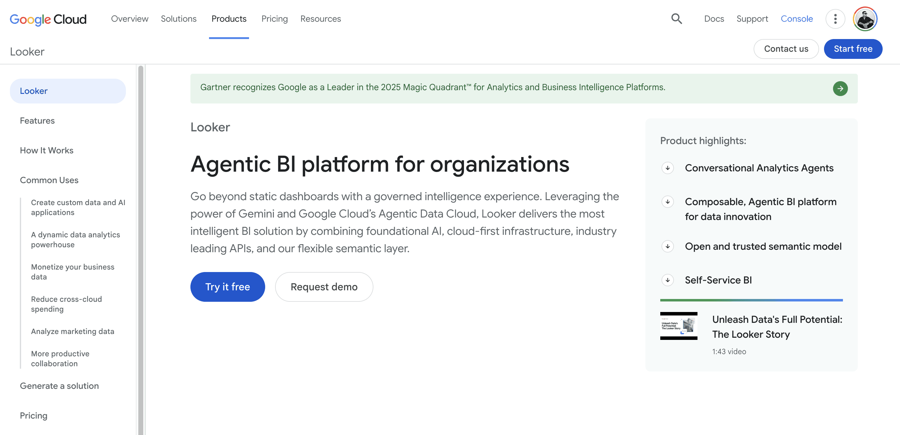
Overview: Looker, part of Google Cloud, is built around LookML, a code layer that defines each metric once and reuses it everywhere.
Key features: LookML semantic model; tight BigQuery integration; consistent, governed metrics.
Pros: Strong metric consistency; robust governance; fits Google Cloud estates.
Cons: Needs engineers to maintain LookML; premium pricing.
Pricing: Premium, quote-based.
Best for: Large data teams that want one governed metric definition at scale.
4. ThoughtSpot: Search-First Self-Service
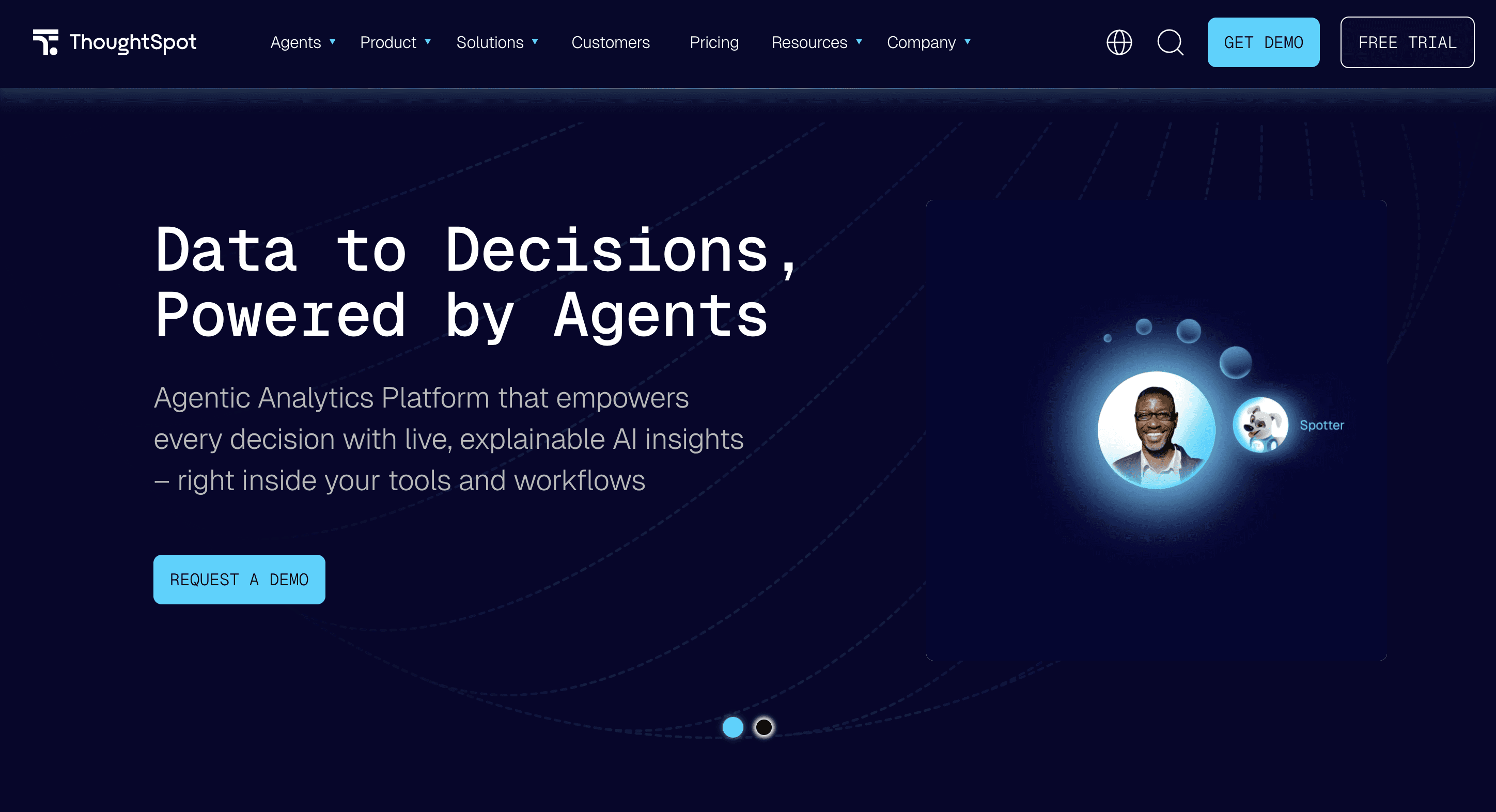
Overview: ThoughtSpot is a search-first platform where users type a question and get a chart back on an in-memory engine.
Key features: Natural-language search; Spotter assistant; embedded Liveboards.
Pros: Approachable for non-analysts; fast self-service on modelled data; mature search UX.
Cons: Premium pricing; needs data consolidated and modelled first.
Pricing: Premium, quote-based; trial available.
Best for: Large organisations that want business users to self-serve through search.
5. Qlik Sense: Associative Exploration
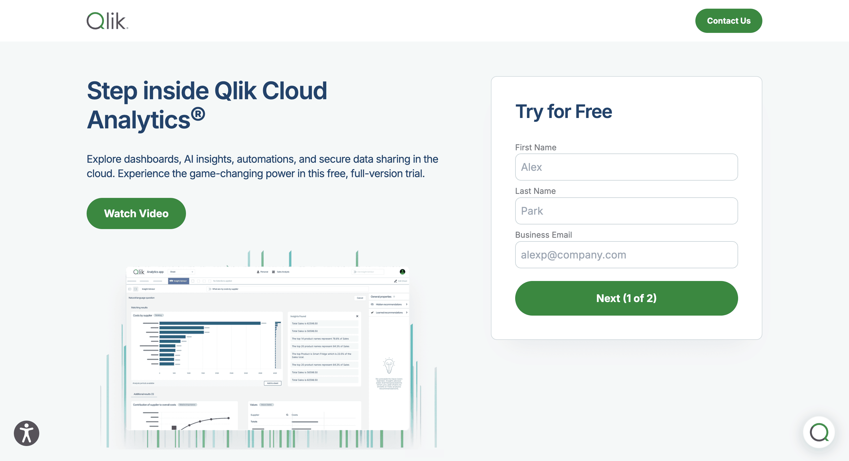
Overview: Qlik Sense uses an associative in-memory engine that links every loaded field so users pivot freely across relationships.
Key features: Associative model; on-premises or cloud deployment; broad connectors.
Pros: Flexible exploration; strong on-premises option; enterprise governance.
Cons: Data is loaded rather than queried live; a real learning curve.
Pricing: Per-user and capacity-based tiers.
Best for: Analyst teams exploring relationships across many loaded sources.
6. Sigma: Spreadsheet-Native Analysts
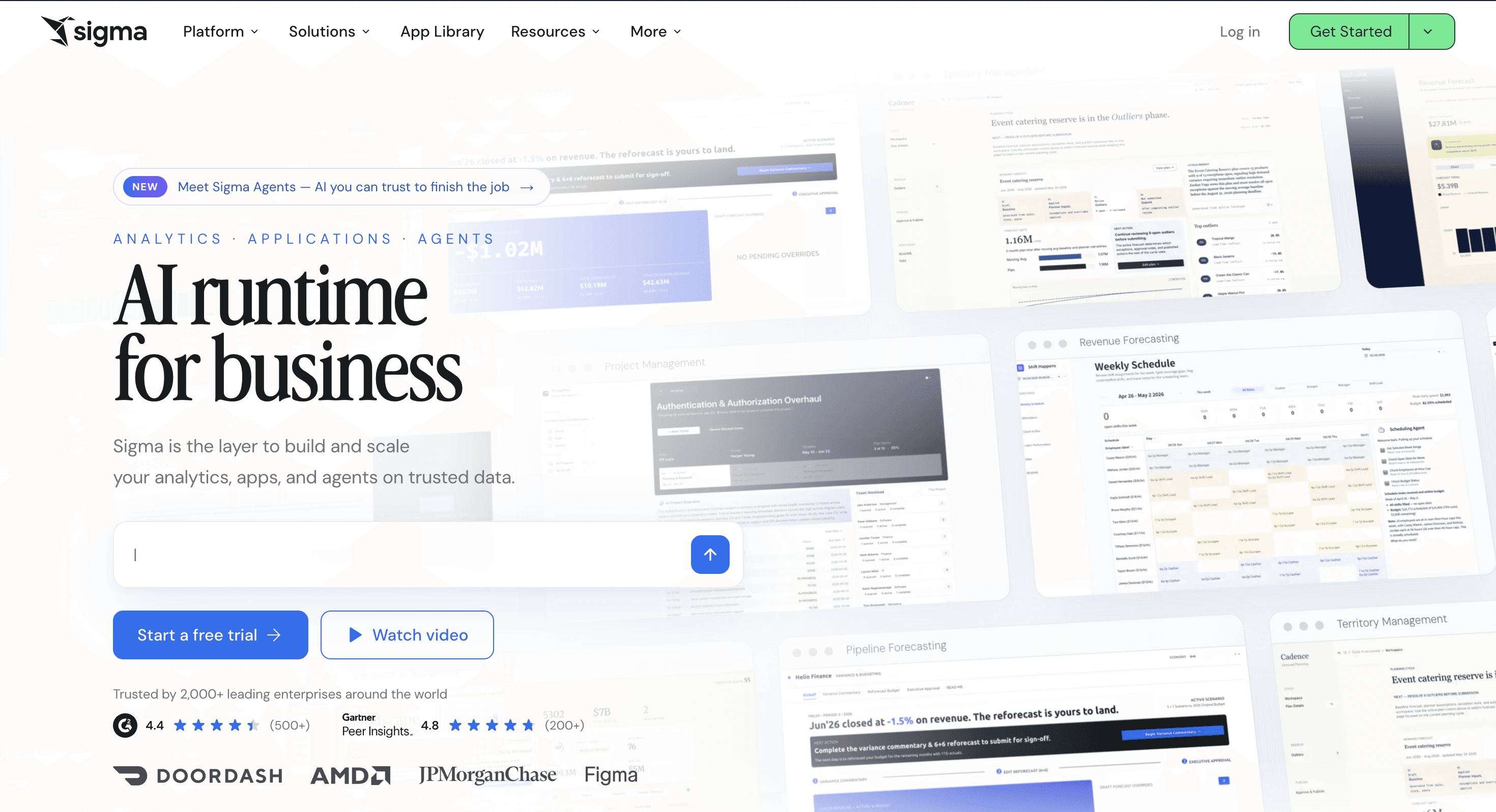
Overview: Sigma is a cloud tool with a spreadsheet-style interface that queries a cloud warehouse directly.
Key features: Spreadsheet UX on live warehouse data; no extracts; collaborative workbooks.
Pros: Gentle on-ramp for Excel users; runs on the warehouse; no data movement.
Cons: Cannot join across separate connections; warehouse-bound, no on-premises option.
Pricing: Per-user, quote-based.
Best for: Finance and operations teams that think in spreadsheets.
7. Metabase: Free, Self-Hosted Dashboards

Overview: Metabase is an open-source tool that connects straight to a database and builds charts without SQL.
Key features: Open-source core; simple question builder; self-hostable behind a firewall.
Pros: Free to self-host; quick to stand up; helps with residency.
Cons: Shallow multi-step investigation; lighter governance in the free edition.
Pricing: Free open-source edition; paid Pro and Enterprise cloud tiers.
Best for: Cost-sensitive teams wanting dashboards without a per-seat licence.
8. Zoho Analytics: Affordable SMB Reporting
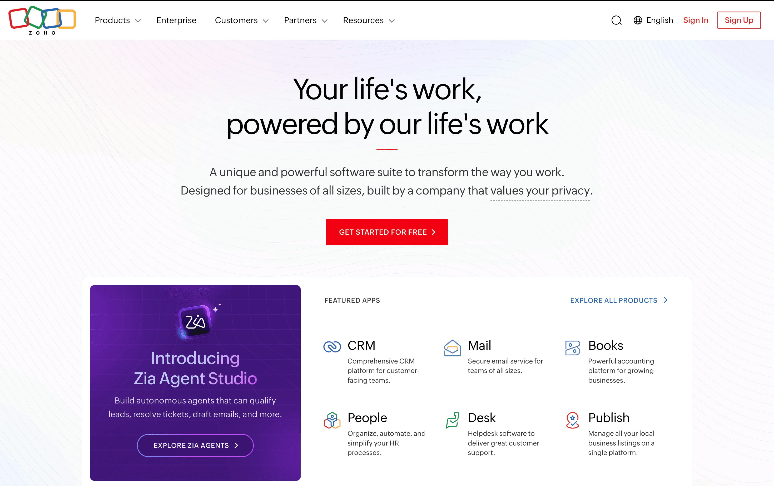
Overview: Zoho Analytics is a low-cost BI tool with AI-assisted insights and tight links to the Zoho suite.
Key features: Automated insights; broad connectors; scheduled reports.
Pros: Among the most affordable options; quick setup; strong within the Zoho ecosystem.
Cons: Less enterprise governance depth; best value inside Zoho tooling.
Pricing: Subscription from roughly $24 per month for small teams.
Best for: Startups and small-to-medium businesses on a tight budget.
9. Sisense: Embedded Analytics
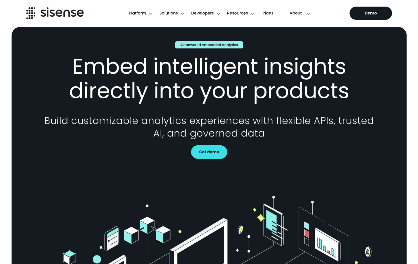
Overview: Sisense is an end-to-end platform packaging data preparation, analytics, and embedding.
Key features: Embeddable dashboards; data preparation; developer APIs.
Pros: Strong embedding; flexible for developers and business users.
Cons: Developer setup effort; cost rises at scale.
Pricing: Quote-based, capacity and usage dependent.
Best for: Teams embedding analytics into their own product.
10. Apache Superset: Developer-Controlled Open Source
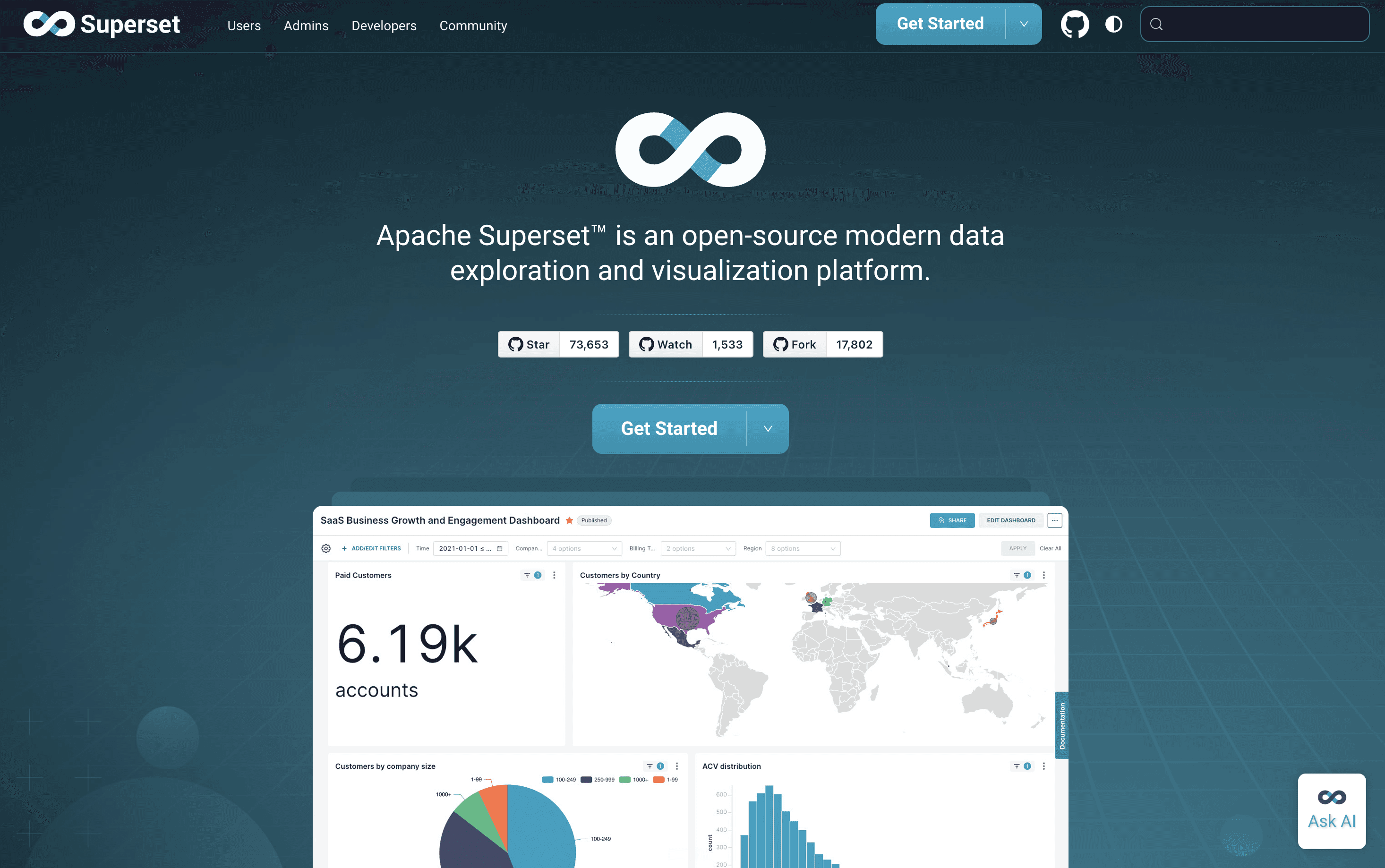
Overview: Apache Superset is an open-source exploration and visualisation platform driven by SQL.
Key features: SQL Lab; wide chart library; fully self-hosted and free.
Pros: No licence cost; highly customisable; large open-source community.
Cons: Needs engineering to run and maintain; not built for non-technical self-service.
Pricing: Free open-source; hosting and engineering time are the real cost.
Best for: Engineering teams wanting a free, customisable stack they control.
How Do the Top Power BI Alternatives Compare?
The table below rates the platforms across five capabilities; Genloop alone is full on all five.
Platform | Query Intelligence | Data Ecosystem Integration | Business User Accessibility | Governance and Compliance | Operational Efficiency |
|---|---|---|---|---|---|
Genloop | ✓ | ✓ | ✓ | ✓ | ✓ |
Tableau | ◐ | ◐ | ◐ | ✓ | ◐ |
Looker | ◐ | ◐ | ◐ | ✓ | ◐ |
ThoughtSpot | ◐ | ◐ | ◐ | ✓ | ◐ |
Qlik Sense | ◐ | ✓ | ◐ | ✓ | ◐ |
Sigma | ◐ | ✓ | ◐ | ✓ | ◐ |
Metabase | ◐ | ◐ | ◐ | ◐ | ✓ |
Zoho Analytics | ◐ | ✓ | ◐ | ◐ | ✓ |
Sisense | ◐ | ◐ | ◐ | ✓ | ◐ |
Apache Superset | ◐ | ✓ | ◐ | ◐ | ◐ |
Full capability ✓, partial ◐.
[Image: capability matrix of Power BI alternatives across query intelligence, data ecosystem integration, business user accessibility, governance and compliance, and operational efficiency. Render via render_table.py before publish.]
Each platform earns a niche: Tableau leads visualisation, Sigma the spreadsheet, Metabase and Superset self-hosting. See Traditional BI vs Conversational Analytics.
Why Do Enterprises of Every Size Now Need Agentic Investigation?
Agentic analytics is an AI system that plans a multi-step investigation across enterprise data and reasons through why something happened, rather than only reporting what happened. This is the layer dashboard-first tools lack, and the need is no longer enterprise-only. A small team needs it because one analyst cannot service every follow-up question. A mid-size team needs it because the volume of questions outgrows the dashboards anyone can build. A large enterprise needs it because the questions that matter span systems no dashboard joins. The promise rests on one thing: the answer has to be right, since an agent that returns a wrong number is worse than no answer. That is why an independent benchmark matters more than a demo. Most tools here ship AI features, yet none publishes a public text-to-SQL result. Genloop leads on accuracy, ranking first on the public Spider 2.0-Snow benchmark at 96.70%, ahead of Tencent at 93.9% and Snowflake at 75%. See What Agentic Analytics Actually Needs.
How to Choose the Right Power BI Alternative
Ask a plain question: do you need better dashboards or the ability to question them? Dashboards do not disappear, so for routine reporting inside Microsoft, Power BI is hard to beat on cost, and Tableau or Looker raise the ceiling on visual craft. If budget is the driver, Metabase, Superset, and Zoho cut the licence line, and a self-hosted option keeps data on your own infrastructure. Those picks answer who draws the charts. The harder question is who does the analysis. When teams of any size need to ask why a number moved, run an agentic workflow, and investigate across systems at once, they need an AI-native layer a dashboard was never built to provide. That is where Genloop leads, on accuracy, query intelligence, platform independence, and cost, while it asks one honest trade: upfront context modelling before the payoff. The durable 2026 setup pairs a dashboard layer with an agentic conversational analytics layer. Start free on Genloop, and see Genloop Is #1 on Spider 2.0.
Frequently Asked Questions
Is dashboard-first software like Power BI becoming obsolete in 2026?
Dashboards are not disappearing, but dashboard-first tools that cannot be questioned or investigated on top are losing ground. Enterprises of every size now need to ask follow-up questions, run agentic workflows, and reason across sources, which Power BI's dashboard-plus-copilot model does not support. The durable pattern pairs a dashboard layer with an agentic layer.
What is the best Power BI alternative for data-driven insights in 2026?
There is no single winner, because it depends on your constraint. Tableau leads on visualisation, Looker on governed modelling, and Metabase or Zoho on cost. For agentic investigation and accurate answers across several sources, Genloop leads, ranking first on the independent Spider 2.0-Snow benchmark and charging no per-seat fee.
What are the best free Power BI alternatives?
Metabase and Apache Superset are the strongest free options, since both are open-source and self-hostable at no licence cost. Zoho Analytics offers a low-cost paid tier for small teams. Genloop provides a free tier with no per-seat fee, so a team can trial AI-native cross-source analysis without a purchase.
Which Power BI alternative is best for AI-powered analysis?
Genloop is built around agentic, multi-step investigation and is the only tool here with an independent accuracy benchmark. ThoughtSpot offers strong search-first querying on modelled data, and several suites add assisted copilots, but those summarise a dataset rather than reasoning across sources autonomously.
Can a Power BI alternative query several data sources at once?
Most cannot join freely across separate connections, and Power BI itself expects a modelled dataset. Genloop is built for cross-source reasoning, joining across warehouses and databases in place with no ETL and no copies, which is what makes multi-system questions answerable.