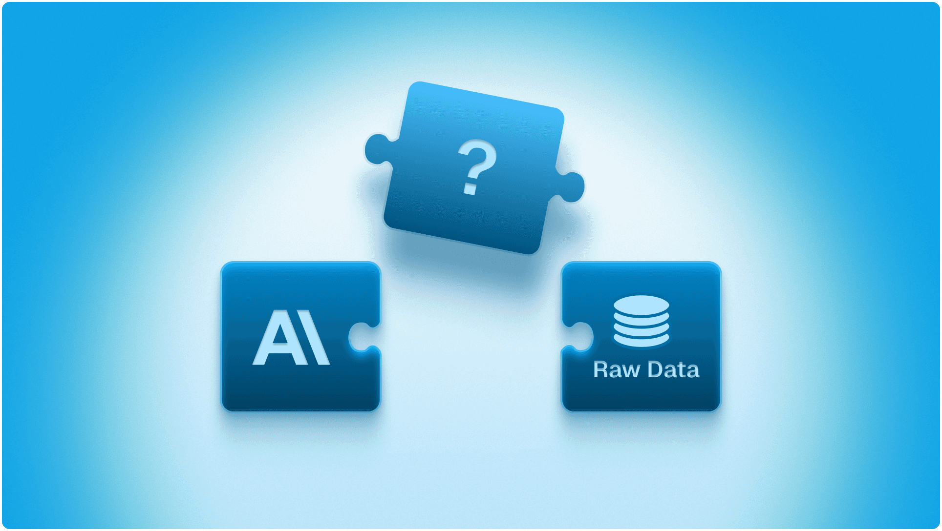

Dashboard software is the category of tools that let teams build and view visual reports on top of business data. In 2026 the way these tools earn money is shifting. For years the model was a per-seat license: pay for every person who logs in to look at a chart. That model is under pressure. A newer wave of tools builds dashboards directly on the database with little data-engineering work, gives the dashboards away for free, and charges only when the software does analyst-level work, such as deep root-cause analysis or automated reporting. This guide compares five dashboard tools, Power BI, Tableau, Looker, Metabase, and Genloop, on the four things that now decide the bill: ease of hosting, cost, agentic analytics capability, and how much ETL each one demands before it is useful.
Key Takeaways
The per-seat-for-charts model is giving way to free dashboards plus paid analysis. The four factors that now decide cost are hosting ease, pricing model, agentic capability, and ETL burden.
Power BI, Tableau, and Looker remain the strongest pure dashboard builders, with the deepest visualisation and governance, but carry per-seat fees and modeling work.
Metabase shows the free, database-native model: open-source, self-hosted at no license cost, pointed straight at your database with minimal ETL.
Genloop pushes furthest on agentic analytics, with free dashboards, minimal ETL, and a pay-for-investigation model that acts as a pocket analyst running RCA and automated reports.
The Bigger Shift: Why Per-Seat Charts Are Losing in an AI World
The honest read is simple: in a world with capable AI, few teams will keep paying dollars per seat just to look at pretty charts. The economics have stopped making sense. Dashboards can now be built directly on top of a database with little BI work and little data engineering, so the view itself can be given away for free. Connecting to live data in place, rather than building and maintaining pipelines, strips out much of the ETL cost that used to pad the bill. So what is genuinely worth paying for? The analyst-level work: deep root-cause analysis, automated reports that explain why a number moved rather than just that it did, and answers that cross several sources at once. That is the part that moves a business forward, and the part a tool should charge for. Seen this way, the most useful product is less a chart viewer and more a pocket analyst, the always-on data hire a lean team could never otherwise afford.
How We Evaluated These Dashboard Tools
This guide scores each tool on four practical criteria that map to what a dashboard stack actually costs to run. Ease of hosting is how much setup and infrastructure you manage before the first dashboard loads, from fully managed SaaS to self-hosted open source. Cost looks past the sticker price to the pricing model, including per-seat fees, free tiers, and what you pay for at scale. Agentic analytics capability is whether the tool can investigate on its own, running multi-step analysis and surfacing findings, rather than only drawing the charts you configure. ETL and data engineering requirements measure how much pipeline work the tool needs before it can answer a question. Genloop publishes this guide, so treat it as one vendor's analysis; the assessments below are grounded in each vendor's public documentation and pricing, and every tool is matched to the niche where it genuinely leads.
What Are the Best Dashboard Software Tools in 2026?
1. Genloop: Best for Teams Who Want a Pocket Analyst, Not Just Charts
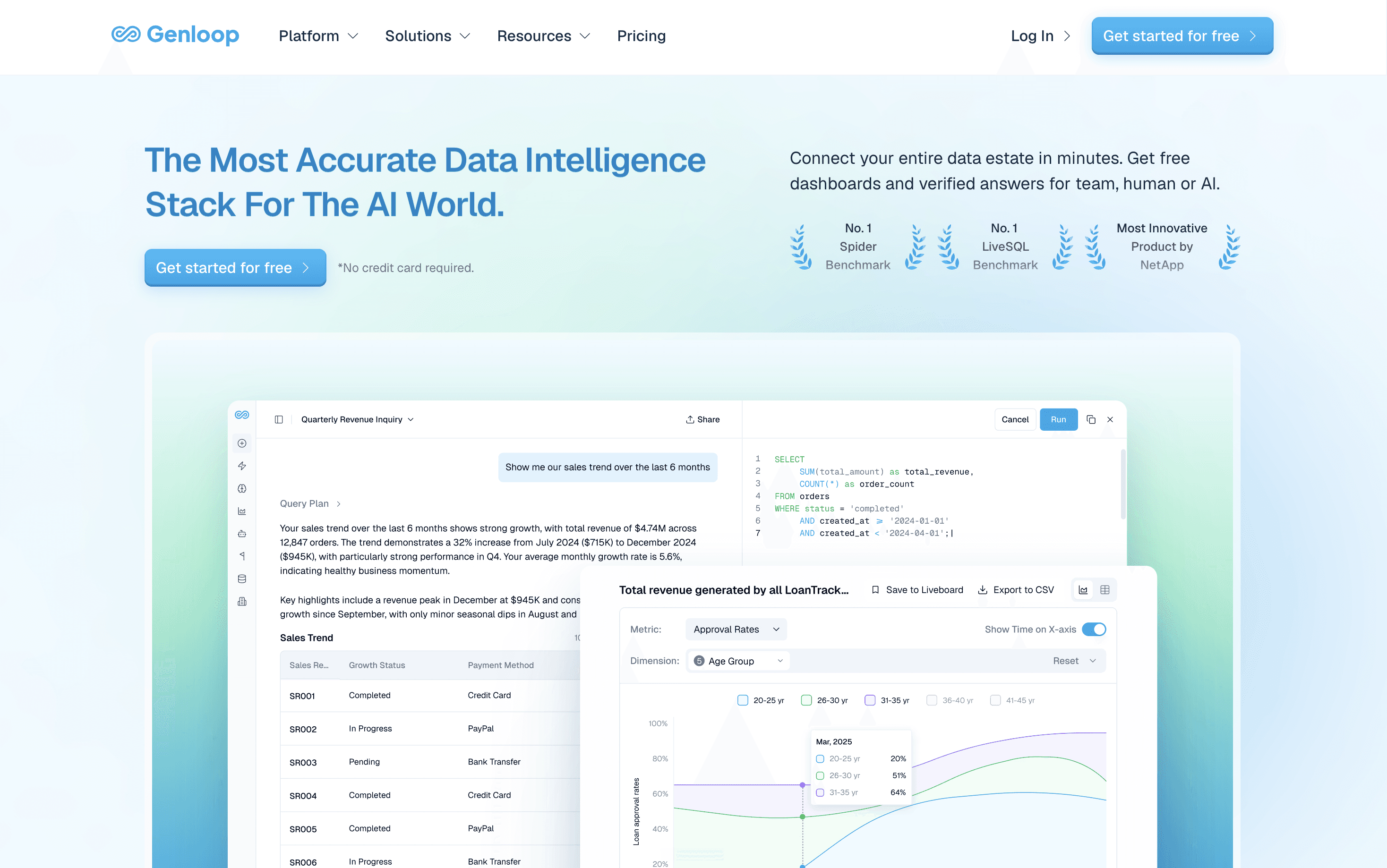
What it does: Genloop is an agentic analytics layer that builds dashboards directly on your databases and also investigates them, answering questions in plain language, running deep root-cause analysis, and generating automated reports across sources.
Why it's great: Genloop leans fully into the new model, separating the cheap part of analytics from the scarce part. Dashboards are free to use and built with minimal ETL because the system queries live data in place rather than waiting on a modeled dataset, so a team can stand up reporting in hours instead of weeks. The paid value is the analyst-level work: automated reports that arrive on a schedule and deep root-cause analysis that explains why a number moved, not just that it did. That makes it a practical pocket analyst for founders and lean teams who cannot staff a full data function, and it answers across several sources at once rather than one curated metric. Its accuracy is independently validated, ranking first on the public Spider 2.0-Snow benchmark at 96.70%, which matters because an automated answer with no analyst checking the work has to be right the first time.
Not a fit if: You mainly need pixel-perfect dashboards to present, where a visualisation-first tool is stronger, or your data is a single simple table you could query directly with a tool like Claude Code and skip a platform.
2. Microsoft Power BI: Best for Microsoft-Native Teams

What it does: Power BI is a dashboard and reporting tool that connects to hundreds of sources and builds interactive visuals, tightly integrated with Excel, Azure, and Microsoft 365.
Why it's great: Power BI is the cheapest entry point for organisations already standardised on Microsoft, and that single fact decides most evaluations in its favor. Native connectors into Azure, SQL Server, and Dynamics shorten setup, and the Copilot layer adds natural-language summaries that help business users read a report without an analyst nearby. The trade-off is that it rewards teams already inside the ecosystem and offers far less to those who are not.
Not a fit if: Your data lives mostly outside Microsoft, or you want autonomous investigation rather than assisted chart-building. Power BI still expects a modeled dataset and a person to drive analysis.
3. Tableau: Best for Visualisation Craft and Self-Service Exploration
What it does: Tableau is a dashboard platform known for visual depth, letting analysts build polished, interactive views by drag-and-drop.
Why it's great: For visualisation craft and exploratory analysis it remains a category leader, with a mature community and strong governance via Tableau Cloud and Server. Its Pulse feature adds metric summaries on curated data for teams that want assisted reading of trusted dashboards.
Not a fit if: Budgets are tight, or you need answers across many raw sources without publishing a modeled data source per metric.
4. Looker: Best for a Governed Semantic Layer at Scale
What it does: Looker, now part of Google Cloud, is a BI platform built around LookML, a modeling layer that defines each metric once and reuses it everywhere.
Why it's great: The semantic layer is the strongest reason to choose it. Define a metric once and every dashboard stays consistent, which large data teams value. It fits organisations standardised on Google Cloud and BigQuery.
Not a fit if: You lack the engineers to maintain LookML, or you want a low-cost or self-hosted option, since Looker sits at the premium end.
5. Metabase: Best for Free, Database-Native Dashboards
What it does: Metabase is an open-source dashboard tool that connects straight to a database and lets non-technical users build charts without SQL.
Why it's great: It is the clearest example of the free, database-native model and wins the pure-cost row. Self-host the open-source edition at no license cost, point it at Postgres, MySQL, or a warehouse, and build dashboards with little data engineering. A managed cloud tier exists for teams that prefer not to self-host.
Not a fit if: You need deep multi-step investigation or governed cross-source joins, or a fully managed enterprise tool.
How Do the Top Dashboard Tools Compare?
The table below scores all five on the four factors that decide cost and effort in 2026. The right pick depends on where your data lives and whether you mainly need charts or answers, and the widest gaps show up in the two columns that increasingly decide the bill: agentic capability and ETL.
Platform | Ease of hosting | Cost | Agentic analytics capability | ETL / data engineering required |
|---|---|---|---|---|
Power BI | Managed SaaS, simple for Microsoft shops | Low per-seat, cheapest for Microsoft orgs | Assisted Copilot summaries, not autonomous | Moderate: needs a modeled dataset |
Tableau | Managed cloud or self-host server | Premium per-seat | Pulse metric summaries, limited scope | Moderate to high: a published source per metric |
Looker | Google Cloud managed | Premium | Some assisted querying | High: LookML modeling upfront |
Metabase | Self-host free, or managed cloud | Free to self-host, paid cloud plus ops time | Minimal | Low: connects directly to the database |
Genloop | Fully managed, fastest setup | Free dashboards, pay only for deep analysis | Agentic: autonomous RCA, reports, multi-step | Minimal: queries live data in place, no modeling |
For where static dashboards stop working, read Are Dashboards Dying, and for the category shift behind these tools, see Traditional BI vs Conversational Analytics.
The Bottom Line: Free Dashboards, Pay Only for Real Analysis
On the four factors that decide the 2026 bill, ease of hosting, cost, agentic capability, and ETL, Genloop comes out ahead. Its dashboards are free to use, setup is fast with minimal pipeline work, and the charge only lands when the system does analyst-level investigation: deep root-cause analysis, automated reports, and answers that span several sources. Its accuracy is independently validated, ranking first on the public Spider 2.0-Snow benchmark, which matters when an automated answer has no analyst checking the work.
The one place it concedes ground is pure visualisation craft: for a pixel-perfect dashboard to present to a board, a visualisation-first tool such as Tableau or Power BI still does that job better, and a single simple table is often faster to query directly with something like Claude Code than to put on any platform at all. For most teams the durable setup is a free dashboard layer for routine reporting plus an agentic layer for the open-ended questions a dashboard was never going to answer, which is the gap Genloop is built to fill. To see how that investigation works in practice, read What Agentic Analytics Actually Needs and the independent results behind it in Genloop is #1 on Spider 2.0.
Frequently Asked Questions
What is dashboard software?
Dashboard software is a category of tools that connect to business data and present it as visual, interactive reports, so people can track metrics without writing SQL. Newer tools build dashboards directly on a database and some can also investigate the data themselves.
Is dashboard software moving away from per-seat pricing?
The per-seat model is under pressure but not gone. Open-source and database-native tools now host dashboards for free or at low cost, which makes charging for read-only viewing harder to justify. Pricing is shifting toward paying for deeper work, such as automated reporting and root-cause analysis, rather than for each viewer.
Which dashboard tool needs the least data engineering?
Metabase and Genloop need the least upfront pipeline work, because both connect directly to live data rather than requiring a modeled dataset first. Looker sits at the other end, since its LookML layer takes real engineering to maintain. Power BI and Tableau fall in between and expect a prepared dataset per report.
Can dashboard software do agentic analysis or just draw charts?
Most dashboard software only draws the charts you configure, with assisted features like Power BI Copilot or Tableau Pulse that summarise existing metrics. Agentic analytics goes further, planning multi-step investigations, finding root causes, and generating reports on its own. Among these five, Genloop is built for autonomous investigation, not assisted charting.
What is the most cost-effective dashboard software?
For pure dashboarding, Metabase is the most cost-effective because its open-source edition is free to self-host, and Power BI is cheapest for teams already on Microsoft. If your costs are dominated by analyst time rather than chart viewing, a tool that gives dashboards free and charges only for investigation, such as Genloop, can be cheaper.
Which dashboard software is best for a startup without a data team?
A startup without analysts usually wants free dashboards and answers it can trust without hiring. Metabase covers free, self-served dashboards, and Genloop adds a pocket-analyst layer that runs root-cause analysis and automated reports with minimal setup. The right pick depends on whether you need only charts or analysis too.